

A sales dashboard that earns its screen space shows five things: pipeline coverage ratio, quota attainment, win rate by segment, forecast accuracy, and lead-to-opportunity conversion. Executives need the top-line revenue trend and forecast band. Managers need coverage and at-risk deals. Reps need activity counts and next actions. None of it matters without fresh data and alerts that fire before a number goes bad.
TL;DR:
- Keeping pipeline coverage ratio between 3x and 4x of remaining quota is crucial for most B2B sales, with higher multiples needed for large deals.
- Focusing on pipeline coverage, quota attainment, and win rate provides the most actionable insights to prevent quarter-end failures.
- Dashboard refresh rates should align with each metric’s decision speed, with activity metrics updating in minutes and revenue figures in hours to days.
- Role-specific dashboards, tailored to executives, managers, and reps, improve decision-making by showing only the most relevant KPIs for each level.
- AI-driven revenue intelligence platforms increasingly predict churn, score leads by intent, and generate alerts automatically, reducing blind spots and manual analysis.
Table of Contents
- What Sales Dashboard Metrics Should Every Dashboard Track?
- How Do You Calculate Each Sales KPI?
- What Should Exec, Manager, and Rep Dashboards Show?
- How Should You Design a Sales Dashboard Layout?
- How Often Should Sales Dashboard Data Refresh?
- What Are Good Benchmarks and Alert Thresholds to Start With?
- How Do You Choose the Right Metrics for Your Business?
- How Does Revenue Intelligence Fix Common Dashboard Blind Spots?
- Where Are Sales Dashboards Headed in 2026?
- Ready to Fix What Your Dashboard Can't See
- Ready to Stop the Revenue Leak?
- Sources
- FAQ
What Sales Dashboard Metrics Should Every Dashboard Track?
Most dashboards fail for one reason: they show everything and prioritize nothing. A rep scrolling through 20 tiles has no idea which number to act on first. The fix is to group key sales metrics into four buckets by what they tell you, then rank them by how fast you need to react.
Lagging revenue metrics tell you what already happened. They're the scoreboard, not the play call.
- Quota attainment — percentage of target hit, tracked by rep, team, and region. Executives and managers both live here.
- Average deal size — average contract value, useful for spotting discount creep or a shift toward smaller, faster deals.
- Win rate — deals won divided by deals closed (won plus lost), sliced by segment, source, and rep. Managers use this to coach; executives use it to sanity-check forecasts.
- Revenue vs. target — actual bookings against the period goal, the number every board meeting starts with.
Leading pipeline metrics tell you what's coming, which is why Salesloft's guidance on dashboard design treats them as the backbone of any forecast a revenue leader can trust.
- Pipeline coverage ratio — total open pipeline value divided by remaining quota. This is the single best early warning for a quota miss.
- Pipeline velocity — how fast deals move through stages, a proxy for cycle health.
- Sales cycle length — average days from opportunity creation to close, segmented by deal size.
- Lead-to-opportunity conversion — the percentage of qualified leads that become real pipeline, the metric that connects marketing spend to sales output.
Activity and efficiency metrics are what reps and frontline managers act on daily.
- Calls, emails, and meetings booked — raw activity counts, meaningless alone but predictive when tied to conversion rates.
- Meetings-to-opportunity rate — how often a booked meeting actually turns into pipeline.
- CAC (customer acquisition cost) — increasingly shared between sales and marketing dashboards for full-funnel accountability.
Customer health metrics protect revenue you already booked.
- Net revenue retention (NRR) — expansion minus contraction and churn, critical for subscription and recurring-revenue businesses.
- Churn risk score — a composite signal (usage drop, support tickets, contract age) that flags accounts likely to leave.
- CAC payback period — months to recover acquisition cost, a health check on unit economics.
If you're building lean and can only fit three tiles on a rep's phone screen, start with pipeline coverage, quota attainment, and win rate. Those three alone catch most of the problems that sink a quarter. Everything else is refinement.
How Do You Calculate Each Sales KPI?
Ambiguous formulas are why two sales managers can look at the "same" metric and argue about whose number is right. Lock these down before you build anything.
- Pipeline coverage ratio = total open pipeline value ÷ remaining quota. A 3x to 4x ratio is the healthy range for most B2B motions, though enterprise deals typically need a higher multiple than transactional sales.
- Win rate = closed-won deals ÷ (closed-won + closed-lost deals). Exclude open pipeline from the denominator, or the number becomes meaningless month to month.
- Quota attainment = actual bookings ÷ assigned quota, expressed as a percentage, calculated per rep and rolled up by team.
- Sales cycle length = average number of days between opportunity creation date and close date, filtered by deal size band since a $5,000 deal and a $200,000 deal don't belong in the same average.
- Forecast accuracy = 1 minus (absolute value of forecasted revenue minus actual revenue) ÷ forecasted revenue, measured at the close of each period.
- Lead-to-opportunity conversion = opportunities created ÷ marketing- or sales-qualified leads, over a fixed time window.
For consistent math, standardize on a short list of CRM fields: deal stage, amount, close date, discount percentage, and product line flags. Skip these and your averages quietly drift.
Two traps wreck most sales dashboard KPIs before anyone notices. Multi-stage deals that get re-created instead of updated inflate both pipeline value and win rate. Duplicate opportunities, especially from re-engaged leads, double-count revenue that was never really there. Run a monthly duplicate check, or your board deck will eventually contradict your CRM.
What Should Exec, Manager, and Rep Dashboards Show?
The mistake most companies make is building one dashboard and handing it to everyone. A CFO and an SDR need entirely different views of the same pipeline, and role-specific dashboards are what actually connect data to a decision instead of just a data dump.
- Executive view: top-line revenue against target, a forecast confidence band (not just one number), pipeline coverage ratio, and a 90-day trendline. Executives don't need stage-by-stage detail; they need to know if the quarter is on track and by how much.
- Manager view: quota attainment distribution across the team (who's ahead, who's behind), a list of at-risk deals flagged by stalled activity or slipped close dates, and stage-by-stage conversion rates to spot where the funnel leaks.
- Rep/SDR view: daily and weekly activity targets, meetings booked versus goal, and a prioritized list of next actions, not a wall of historical charts nobody has time to interpret mid-call.
Keep primary metrics to two or three per role, with everything else available as a drill-down rather than a permanent tile. Dashboards built around 8 to 12 revenue-linked indicators total, spread across roles rather than crammed onto one screen, are the ones that actually get checked daily instead of ignored after week two.
How Should You Design a Sales Dashboard Layout?
Placement is not decoration. It's the difference between a dashboard someone glances at for cause and effect versus one they stare at and shrug.
Put leading indicators directly above the lagging metrics they predict. Meetings booked belongs above closed revenue, not three tabs away, because the visual proximity is what lets a manager connect the dots without hunting.
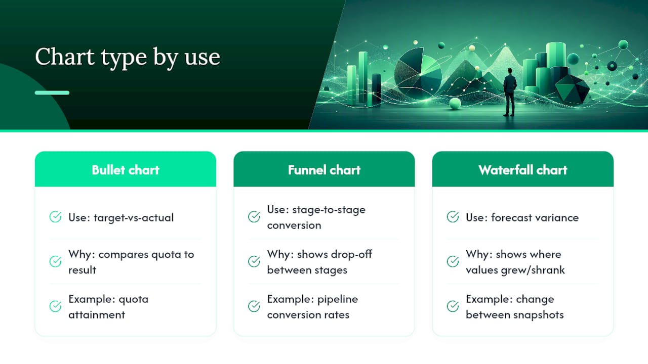
Match the chart type to what the metric is actually asking. Use bullet charts for target-versus-actual comparisons like quota attainment. Use funnel charts for stage-to-stage conversion. Use waterfall charts for forecast variance, since they show exactly where a number grew or shrank between snapshots instead of just the net change.
Cap each screen at three to five visible items. Beyond that, you're not building a dashboard, you're building a report nobody reads at a glance. Keep color thresholds consistent across every view; red should always mean the same thing whether it's on the exec screen or the rep screen. And every summary tile needs an obvious click-through to deal-level detail, because a flagged number with no drill path just generates more Slack messages asking "which deals?"
Pro Tip: Test your layout by covering everything except the top third of the screen. If a manager still can't tell whether the week is going well from that alone, your most important metrics aren't placed high enough.
How Often Should Sales Dashboard Data Refresh?
Not every metric needs to update in real time, and treating all of them the same way either wastes engineering budget or leaves you flying blind.
- Activity metrics (calls, emails, meetings logged): refresh in real time, under 15 minutes. Reps need to see today's numbers today.
- Pipeline metrics (coverage, stage movement): refresh under 1 hour. Fast enough to catch a deal slipping stages without needing streaming infrastructure.
- Revenue metrics (bookings, quota attainment): refresh under 6 hours. Daily batch syncs are usually fine here.
- Customer health metrics (churn risk, NRR): refresh under 24 hours, since these signals move slowly and rarely need hourly recalculation.
Streaming architecture costs more to build and maintain than batch syncs, so match the investment to the metric's actual decision speed, not to what sounds impressive in a vendor pitch. A quick freshness check: add a "last updated" timestamp to every dashboard tile, and audit weekly for tiles that haven't moved when the underlying CRM clearly has new activity. That gap is usually the first sign of a broken sync, not a quiet week.
What Are Good Benchmarks and Alert Thresholds to Start With?
Benchmarks only help if you tune them to your own sales motion. A transactional SMB deal and an enterprise sale don't share the same win rate or cycle length expectations, so treat these as starting points, not gospel.
| Metric | Healthy Range | Notes |
|---|---|---|
| Pipeline coverage ratio | 3x to 4x remaining quota | Higher for enterprise, lower for high-velocity transactional sales |
| Quota attainment | around 60% of reps hitting quota | Below 60% often signals a territory or comp plan problem, not a rep problem |
| Win rate | Varies by segment | Compare against your own trailing 12 months, not industry averages |
| Sales cycle length | Varies by deal size | Segment by deal size band before comparing month to month |
Set alert rules around the moments that actually require intervention. A useful starting rule: if pipeline coverage drops below a healthy threshold well before the end of the quarter, trigger a pipeline review and a possible territory reallocation before the shortfall becomes irreversible. Another: if a rep's quota attainment trend falls two consecutive weeks below their historical pace, flag it for a coaching conversation, not a public leaderboard callout.
- Start thresholds slightly wider than you think you need, then tighten as you learn your normal variance.
- Review alert-triggered events monthly and kill any rule that fires more than a few times without leading to a real action.
- Segment thresholds by deal size, region, or source before assuming one number applies company-wide.
How Do You Choose the Right Metrics for Your Business?
Work backward from the decision, not forward from the data you happen to have. The framework is simple: start with a business goal, identify the decision that goal depends on, then find the leading KPI that predicts it and the lagging KPI that confirms it. Everything else is a diagnostic metric that exists to explain why the primary number moved.
- Define the goal. "Hit 20% revenue growth this year" is a goal; "increase call volume" is an activity, not a goal.
- Identify the decision. Growth depends on whether pipeline coverage supports the target, so pipeline coverage becomes the leading KPI and quarterly bookings becomes the lagging confirmation.
- Map data sources. Pull deal stage, amount, and close date from the CRM; pull activity counts from your dialer or email tool; pull support and usage signals from your product or ticketing system for health metrics.
- Set governance rules. Decide who owns field accuracy, how often duplicates get audited, and what "closed" actually means across every team using the CRM.
- Run a pilot. Roll the dashboard out to one team or region before company-wide deployment.
A realistic pilot plan: days 1 to 30, build the core five metrics and validate the data against manual spreadsheets; days 31 to 60, add role-specific views and alert thresholds, and get feedback from the managers actually using it; days 61 to 90, expand to the full team and set the success bar at "managers check it daily without being told to." If that bar isn't cleared by day 90, the dashboard is wrong, not the team. A guide to building a revenue dashboard without a dedicated data team walks through this exact sequence for smaller sales organizations.
How Does Revenue Intelligence Fix Common Dashboard Blind Spots?
Most dashboards show what happened. Few show what's about to happen, which is the gap Signalengine is built to close for small and midsize sales teams that don't have a data analyst on staff.
- Lead scoring by buying intent removes the guesswork from "which pipeline actually deserves attention this week."
- Churn prediction flags at-risk accounts before renewal conversations start, feeding directly into the customer health quadrant.
- Missed call recovery plugs a leak most dashboards never even measure: opportunities that never got scored because they never got answered.
- Pipeline analytics ties activity and conversion data together automatically instead of requiring a spreadsheet reconciliation every Friday.
A useful pilot use case: track deal push rate (deals that slip their close date more than once) before and after adding automated alerts. Teams chasing this exact blind spot can start with Signalengine's sales pipeline analytics resource for a concrete before-and-after framework, or review common blind spot examples to see which one is most likely hiding in your own numbers.
Where Are Sales Dashboards Headed in 2026?
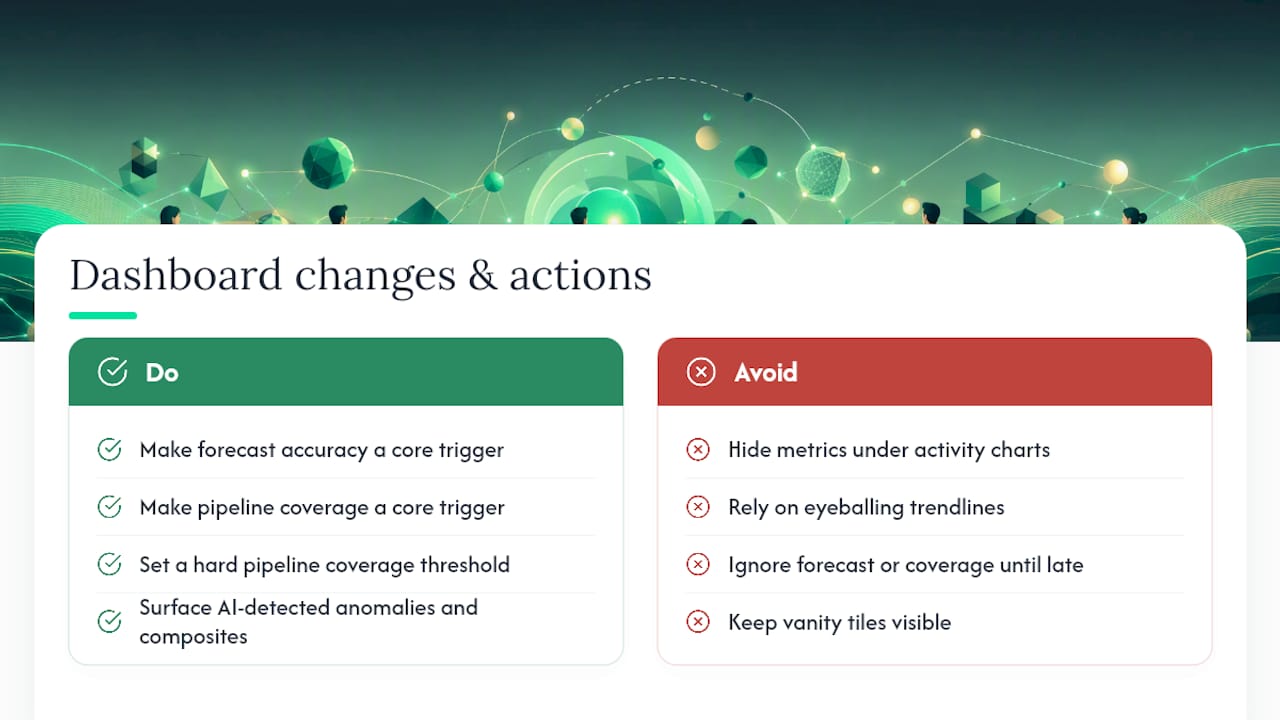
The next wave of dashboards won't ask you to interpret a chart. They'll tell you what changed and why, because AI-surfaced anomalies are replacing the old habit of eyeballing a trendline and guessing. Composite indicators, a blend of pipeline health, engagement, and rep behavior into one risk score, are quietly making a dozen vanity tiles obsolete.
If you only fix one thing this quarter, make forecast accuracy and pipeline coverage your core decision triggers instead of secondary tiles buried under activity charts. Nearly every forecast miss traces back to one of those two numbers being ignored until it was too late. The operational change worth making today: put a hard threshold on pipeline coverage and make it impossible to hide once the quarter clock is running out.
— Bernard
Ready to Fix What Your Dashboard Can't See
Every recommendation in this article, pipeline coverage alerts, forecast accuracy tracking, churn risk scoring, real-time activity views, is built into some revenue intelligence dashboards that centralize these metrics rather than use disconnected spreadsheets. Where a typical BI tool shows you a chart and leaves the interpretation to you, Certain AI-driven platforms score leads by buying intent, predict churn in advance of renewals, and fire alerts when coverage ratios decline, helping users act on leading indicators instead of lagging ones.
If you're ready to stop rebuilding the same spreadsheet every Monday, check Signal Engine Scale's pricing and see which tier fits your team size. Teams already running it can review Signal Engine's setup docs to map today's KPIs onto a live dashboard in an afternoon, not a quarter.
Ready to Stop the Revenue Leak?
Signal Engine gives small and local businesses 31 AI-powered tools to score leads by buying intent, predict churn before it happens, auto-generate email and SMS campaigns, and recover missed calls automatically — all in one dashboard starting at $49/month. Start your free 7-day trial — no credit card required. Setup takes 5 minutes.
Sources
For the formulas and quadrant framework behind this guide, the Sales Dashboard Guide on metrics, benchmarks, and design covers refresh latency and revenue-risk lead time in more depth. The 10 sales dashboard KPIs checklist is useful for benchmark ranges beyond pipeline coverage. For aligning sales KPIs with marketing-sourced lead data, Babylovegrowth's guide to measuring website success offers a complementary framework. Teams evaluating a fast setup path can start with Signal Engine's onboarding walkthrough.
- Sales Dashboard Guide: Metrics, Benchmarks & Design (2026)
- What Metrics Belong on a Sales Dashboard?
FAQ
What Are the Top 5 Sales KPIs?
Pipeline coverage ratio, quota attainment, win rate, forecast accuracy, and average deal size cover the core of what most sales teams need to track, with lead-to-opportunity conversion as a close sixth for anyone tracking funnel health.
What Is a Good KPI Dashboard for Sales?
A good sales dashboard shows role-specific views, executives get revenue-versus-target and forecast bands, managers get at-risk deals and conversion rates, reps get activity targets, refreshed on a cadence matched to each metric's urgency rather than one blanket schedule.
What Are Metrics in a Dashboard?
Dashboard metrics are the specific, quantifiable indicators, like win rate or pipeline coverage, chosen to represent progress toward a business goal, paired with a visual and a refresh cycle that keeps the number current enough to act on.
What Are Examples of Sales Metrics?
Common examples include quota attainment, win rate, average deal size, sales cycle length, pipeline coverage ratio, lead-to-opportunity conversion, and customer health signals like churn risk score and net revenue retention.