

Cohort analysis retention is the practice of grouping users by a shared starting event (typically signup month) and tracking what percentage of each group stays active over time. Your single highest-leverage first move: run a month-0 to month-3 acquisition cohort on your last six signup classes right now, then compare the rows. If newer cohorts are flatter than older ones, your onboarding changed something. If they're steeper, you have a problem that your overall retention dashboard is almost certainly hiding.
Three quick signals that make this worth doing immediately:
- Research from Stripe confirms that cohort grouping reveals patterns that aggregate metrics routinely obscure.
- CustomerGauge cites research suggesting a small increase in retention can significantly increase profits.
- Standard retention benchmarks (D1, D7, D30, M3) only become meaningful when you compare them across cohorts, not just as a single blended number.
Key Takeaways
Cohort analysis retention is only as valuable as the experiments it generates: run the acquisition cohort first, find the vertical trend, then design one testable intervention before the next cohort matures.
| Point | Details |
|---|---|
| Start with acquisition cohorts | Compare the last six signup classes on Month-1 retention to spot vertical trends before they compound. |
| Use the Month-N formula | Divide retained users at tenure N by original cohort size, multiply by 100; keep the retention event definition identical across all cohorts. |
| Rebase to filter tourist noise | Measure M12 relative to M3 (not M0) to reveal your foundational cohort and strip out early low-intent signups. |
| Every analysis needs a hypothesis | A cohort chart with no testable next action is just a decoration; end every session with one specific experiment to run. |
| Signalengine automates the intervention | Signalengine scores churn risk automatically and fires outreach at the right tenure offset, replacing the manual monthly export cycle. |
Table of Contents
- What does cohort analysis actually measure for retention?
- Which cohort type should you use?
- How do you read a cohort retention table?
- How do you run a cohort retention analysis step by step?
- What are the exact formulas and key metrics to track?
- What experiments should you run after reading your cohort data?
- What are the most common cohort retention mistakes?
- What should you look for in a cohort analysis tool?
- How can a small business run cohort retention analysis in 30 days?
- What I'd do first as a product manager this week
- Ready to Stop the Revenue Leak?
- Sources
- FAQ
- Ready to Stop the Revenue Leak?
What does cohort analysis actually measure for retention?
A cohort is any group of users who share a defining event within the same time window. The most common anchor is signup month: everyone who created an account in January forms one cohort, February forms another, and so on. Stripe's cohort analysis guide describes this grouping as the foundation for spotting whether newer cohorts retain better or worse than older ones — something a single blended retention line can never show you.
Cohort retention then asks: of the 200 users who signed up in January, how many were still active in February (Month 1), March (Month 2), and April (Month 3)? You repeat that question for every cohort and lay the answers side by side.
Here's why that matters more than a headline metric. Suppose your overall monthly retention rate holds steady at 72% for six straight months. That looks fine. But if you split it by signup cohort, you might find that your January and February cohorts retain at 80%, while your May and June cohorts retain at 58%. The two groups are averaging out to 72% — and the worsening trend is completely invisible until you separate them.
Key distinctions to keep in mind:
- Cohort retention tracks a fixed group forward from their start date (longitudinal).
- Aggregate retention measures all active users in a given period, mixing cohorts of different ages and sizes.
- Retention event is the specific action that counts as "still active" — a login, a transaction, a feature use. You define it; the definition must stay consistent across all cohorts you compare.
Which cohort type should you use?
Not every retention question needs the same cohort type. Choosing the wrong one produces a chart that looks informative but answers the wrong question.
-
Acquisition cohorts group users by when they first joined or converted. Use these to diagnose trends over time: "Are users who signed up after we changed our pricing page retaining differently?" This is the default starting point for most teams.
-
Behavioral cohorts group users by an action they took (or didn't take) regardless of signup date. Use these to explain why a trend exists: "Do users who completed onboarding step 3 within 48 hours retain at a higher rate at Month 3?" Amplitude's research on activation and retention supports pairing behavioral cohorts with acquisition cohorts — acquisition cohorts tell you that something changed; behavioral cohorts tell you what drove it.
-
Predictive cohorts group users by a score or signal that forecasts future behavior, such as a churn risk score or an engagement tier. Use these to act before the drop happens. Signalengine's churn prediction tools operate on this principle: score behavior automatically, then flag the cohort most likely to leave before they do.
The practical sequence: start with acquisition cohorts to spot the trend, layer in behavioral cohorts to find the driver, then build predictive cohorts to intervene early.
How do you read a cohort retention table?
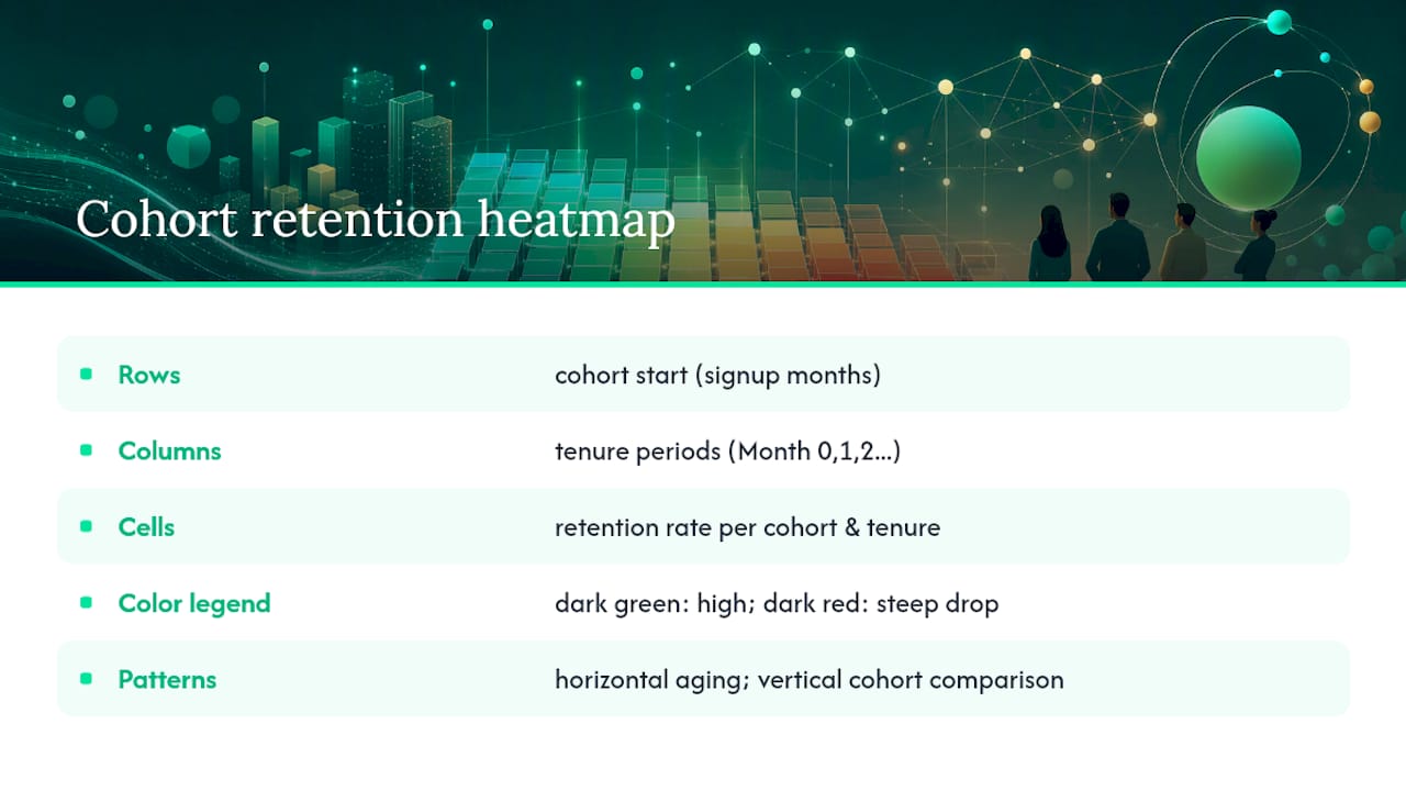
Google Analytics documents the standard layout: rows represent cohort start periods (e.g., each signup month), and columns represent tenure periods (Month 0, Month 1, Month 2, and so on). Each cell shows the retention rate for that cohort at that tenure. A color-coded heatmap version, recommended by KPI Tree, makes horizontal and vertical patterns visible at a glance — darker green means higher retention, darker red means steeper drop.
Retention table: sample layout
Reading the table horizontally (across a single row) shows how a specific cohort ages. A steep drop from Month 0 to Month 1 almost always points to an onboarding problem. A plateau from Month 2 onward signals the "foundational cohort" — the users who actually found value and stuck around.
Reading vertically (down a single column) shows whether the same tenure period is improving or worsening across successive cohorts. In the sample above, Month 1 retention is declining from January to April. That's a trend worth investigating before it compounds.
Interpretation checklist
- Horizontal cliff at Month 1: Onboarding is failing to deliver early value. Run an activation experiment.
- Steady tail after Month 2–3: You have a foundational cohort. Focus on monetizing and expanding these users.
- Vertical decline across cohorts: A product change, pricing shift, or acquisition channel mix is hurting newer users. Isolate the variable.
- Smile curve (drop, then recovery at later months): A re-engagement trigger is working, or seasonal users are returning. Map the recovery to a specific campaign or season.
- Flat line near zero: No foundational cohort exists yet. The product hasn't found its retained audience.
Pro Tip: a16z recommends rebasing — measuring M12 relative to M3 rather than M0 — to strip out early "tourist" churn and reveal the true foundational cohort. This is especially useful when low-friction or AI-assisted signups inflate your early cohort sizes.
How do you run a cohort retention analysis step by step?
Step 1: Define your data requirements
Before writing a single query, nail down four things:
- Cohort anchor event: What marks the start of a user's lifecycle? (First signup, first purchase, first login.)
- Retention event: What counts as "active" in a subsequent period? (Login, transaction, specific feature use.)
- Time window: Are you measuring daily (D1, D7, D30) or monthly (M1, M3, M6)?
- Deduplication rule: One row per user per cohort period. Users who appear in multiple channels or devices need a canonical ID.
Step 2: Extract and assign cohorts
Pull your user table and join it to your events table. Assign each user to a cohort based on their anchor event date, truncated to the period you're using (week or month). Every subsequent event for that user gets labeled with the tenure offset from their cohort start.
Step 3: Aggregate retention by cohort and tenure
Count distinct users active in each (cohort, tenure) pair, then divide by cohort size. Multiply by 100 for a percentage.
Step 4: Filter and smooth
Remove cohorts with fewer than 30 users (small-N distortion). For very recent cohorts, mark later tenure columns as incomplete rather than zero — they haven't had time to mature.
Step 5: Interpret and act
Apply the interpretation checklist from the previous section. Every analysis must end with a testable hypothesis, not just a chart.
SQL snippet for cohort retention
The query below works in BigQuery, Redshift, and Snowflake with minor syntax adjustments.
WITH cohorts AS (
  SELECT
    user_id,
    DATE_TRUNC('month', first_seen_at) AS cohort_month
  FROM users
),
activity AS (
  SELECT
    e.user_id,
    c.cohort_month,
    DATE_DIFF('month', c.cohort_month, DATE_TRUNC('month', e.event_at)) AS tenure_month
  FROM events e
  JOIN cohorts c ON e.user_id = c.user_id
  WHERE e.event_type = 'active_session'  -- replace with your retention event
),
cohort_sizes AS (
  SELECT cohort_month, COUNT(DISTINCT user_id) AS cohort_size
  FROM cohorts
  GROUP BY 1
),
retention AS (
  SELECT
    a.cohort_month,
    a.tenure_month,
    COUNT(DISTINCT a.user_id) AS retained_users
  FROM activity a
  GROUP BY 1, 2
)
SELECT
  r.cohort_month,
  r.tenure_month,
  cs.cohort_size,
  r.retained_users,
  ROUND(100.0 * r.retained_users / cs.cohort_size, 1) AS retention_rate
FROM retention r
JOIN cohort_sizes cs ON r.cohort_month = cs.cohort_month
ORDER BY 1, 2;
The critical join is cohorts to events on user_id, with DATE_DIFF computing the tenure offset. Replace active_session with your actual retention event name.
Spreadsheet pivot method (no SQL required)
- Create a flat table: columns are
user_id,cohort_month,activity_month. - Add a calculated column:
tenure = activity_month - cohort_month. - Insert a pivot table: rows =
cohort_month, columns =tenure, values =COUNTUNIQUE(user_id). - Add a second pivot or a formula row that divides each cell by the Month-0 count for that cohort.
- Apply a color scale (green = high, red = low) to create the heatmap.
Worked numeric example
Your January cohort has 100 users. In February (Month 1), 52 of them log back in. In April (Month 3), 38 are still active.
- Month-1 retention: 52 ÷ 100 × 100 = 52%
- Month-3 retention: 38 ÷ 100 × 100 = 38%
Run the same calculation for February, March, and April cohorts, then read the vertical column for Month 1 to see whether that 52% is improving or declining across signup classes.
Pro Tip: Always check whether your "Month 0" cell is 100% for every cohort. If it isn't, your cohort anchor event and your retention event are misaligned — fix the definition before reading anything else.
What are the exact formulas and key metrics to track?
The standard formula, as documented by KPI Tree:
Month-N Retention Rate = (Users from cohort still active at Month N ÷ Original cohort size) × 100
Two common variants exist for "active":
- Login-based: Any session counts. Easier to measure, but inflated by passive users.
- Event-based: A specific action (purchase, feature use, message sent) counts. More predictive of revenue and LTV.
Event-based retention is almost always the more useful signal for product decisions.
Recommended metrics to track per cohort
| Metric | What it tells you | When to act |
|---|---|---|
| D1 retention | Did users return the next day? | Below 25% for most consumer apps signals a first-session problem |
| D7 retention | Did users form a weekly habit? | Declining D7 across cohorts = onboarding or activation issue |
| D30 retention | Did users survive the first month? | Benchmark against SaaS Capital norms for your category |
| M3 retention | Is there a foundational cohort? | Flat M3 across cohorts = stable core; declining = systemic problem |
| Cohort size | Is the sample large enough to trust? | Under 30 users: do not act on the rate alone |
| Cohort LTV | Are retained users generating more revenue? | Rising LTV with flat retention = upsell opportunity |
Retention benchmarks vary sharply by category. SaaS Capital's data on private SaaS businesses shows that "good" annual retention differs by ARR band and growth stage. Always compare your cohort numbers to your own category's norms, not a generic industry average.
What experiments should you run after reading your cohort data?
Cohort data without an experiment is just a chart. Here are five concrete plays, ordered by typical impact-to-effort ratio:
-
Onboarding A/B test (highest impact). If Month-1 retention is declining vertically across cohorts, split your next signup class into two groups: one sees your current onboarding flow, the other sees a revised version with a faster time-to-value moment. Measure D7 and M1 retention as your primary metrics. Success threshold: a 5-percentage-point lift in M1 retention.
-
Behavioral cohort email/SMS sequence. Identify the activation action most correlated with M3 retention (e.g., completing a profile, connecting an integration, making a first purchase). Build a lifecycle sequence that nudges users who haven't taken that action within 48 hours. Automating this outreach removes the manual bottleneck and fires the message at exactly the right tenure offset.
-
Win-back cadence at the known drop window. Your cohort table shows exactly when users leave. If Month 2 is your steepest cliff, schedule a win-back campaign to fire at Day 45. Personalize it with the specific feature or value the user engaged with most before going quiet.
-
Feature nudge tied to activation. For users in a behavioral cohort who used Feature A but never Feature B, send a targeted in-app prompt or email at Month 1. Track whether Feature B adoption lifts M3 retention for that segment.
-
Pricing or plan cohort test. If cohorts acquired on a promotional price retain worse at Month 6 than full-price cohorts, you have a "tourist" pricing problem. Test a higher-friction trial (credit card required, shorter trial window) and measure whether M3 retention improves even if trial-to-paid conversion dips slightly.
Prioritizing experiments
Score each experiment on two axes: expected retention impact (how many percentage points could this move M1 or M3?) and implementation effort (days of engineering or content work). Run the high-impact, low-effort plays first. Onboarding copy changes and email sequences almost always beat feature builds on this matrix.
Success criteria per experiment:
- Onboarding A/B: 5-point lift in M1 retention, measured over two full cohort cycles.
- Lifecycle email: 3-point lift in M3 retention for the targeted behavioral cohort.
- Win-back cadence: 10% reactivation rate among churned users in the target tenure window.
- Feature nudge: measurable increase in Feature B adoption within 14 days of the prompt.
Pair every cohort experiment with Voice-of-the-Customer feedback, as CustomerGauge recommends, to understand why the numbers moved, not just that they moved.
What are the most common cohort retention mistakes?
Most cohort misreads come from one of six sources. Check these before acting on any signal:
- Small cohort size. A cohort of 12 users showing 83% M3 retention is noise, not a signal. Set a minimum of 30 users per cohort before drawing conclusions; 100+ is preferable for D1/D7 metrics.
- Blended cohorts. Mixing B2B accounts (which may have multiple users) with individual consumer signups inflates cohort sizes and distorts rates. Segment by account type before comparing.
- Metric drift. If your definition of "active" changes mid-analysis (e.g., you switch from login-based to event-based retention), older and newer cohorts are no longer comparable. Document every definition change with a date.
- Seasonality. A December cohort that retains better in January may reflect holiday gifting, not product improvement. Always compare cohorts from the same season across years when possible.
- Tourist and bot noise. Low-friction signups (free tiers, AI-assisted onboarding, social login) attract users who never intended to stay. a16z's AI retention research recommends rebasing to M3 as the new baseline to filter this noise and reveal the foundational cohort. Userpilot also flags "AI tourists" — automated accounts that inflate early cohort sizes and make Month-0 look larger than it really is.
- Attribution window changes. If your marketing team changes the attribution model mid-year, cohorts acquired before and after the change may appear to have different sizes even when underlying acquisition volume is identical.
Pro Tip: Before comparing two cohorts, run a quick sanity check: are the cohort anchor event, retention event, time zone, and attribution window identical for both? If any one of those four differs, the comparison is invalid.
Correlation vs. causation
A cohort showing higher retention after a feature launch does not prove the feature caused the lift. Users who adopt new features early tend to be more engaged to begin with. The only way to establish causation is a controlled experiment where cohort assignment is randomized. Use cohort analysis to generate the hypothesis; use an A/B test to confirm it.
What should you look for in a cohort analysis tool?
The right tool depends on your data volume, team SQL fluency, and how fast you need answers. Here's the feature checklist to evaluate any platform:
- Flexible cohort builder: Can you define cohorts by any event, not just signup date?
- Custom retention events: Can you swap "login" for a specific action (purchase, API call, feature use)?
- Segmentation layer: Can you filter a cohort by geography, device, plan tier, or acquisition channel?
- Cohort heatmap view: Does the UI render the color-coded matrix automatically?
- Cohort export: Can you pull raw cohort data to a spreadsheet or warehouse for deeper analysis?
- Experimentation integration: Does the tool connect to your A/B testing platform so you can measure experiment impact by cohort?
- Automated alerts: Will it notify you when a new cohort's D7 or M1 rate drops below a threshold?
Data architecture decision matrix
| Approach | Best for | Tradeoffs |
|---|---|---|
| Spreadsheet pivot | Teams under 1,000 users, no SQL required | Manual refresh, limited segmentation |
| UI-first analytics platform | Fast insights, non-technical stakeholders | Less flexible definitions, vendor lock-in |
| Warehouse-first SQL | Large scale, full auditability, custom events | Requires SQL fluency, slower iteration |
Move from spreadsheets to a UI platform when your cohort sizes exceed 1,000 users or when you need to run more than two segments simultaneously. Move to a warehouse-first approach when you need custom event definitions that no UI tool supports, or when audit trails matter for compliance. Monitoring product engagement signals at the warehouse level gives you the most flexible foundation for cohort work at scale.
How can a small business run cohort retention analysis in 30 days?
A bookings-based SMB (say, a dental practice or a home services company) can run a minimal viable cohort analysis with three data points per customer: first booking date (cohort anchor), subsequent booking date (retention event), and revenue per visit (LTV proxy).

Cohort anchor: Month of first appointment. Retention event: Any appointment completed in a subsequent month. KPIs to watch: M1 retention (did they rebook within 30 days?), M3 retention (are they a regular?), and average revenue per retained customer.
30-day micro-play
Week 1: Data check. Export your customer list with first-visit and all-visit dates. Assign cohort months. Calculate M1 and M3 retention for the last four cohort classes. Flag any cohort with fewer than 30 customers as low-confidence.
Week 2: Identify the drop. Find the tenure column where retention falls sharpest. For most service businesses, it's between Month 1 and Month 2. That's your intervention window.
Week 3: Launch one experiment. Send a targeted SMS or email to customers in the current cohort who haven't rebooked by Day 25. Keep the message specific: reference their last service, offer a concrete next step. Track reactivation rate over 14 days.
Week 4: Review and schedule. Compare the reactivation rate of the messaged group to the prior cohort's Month-2 retention. If the rate is higher, the experiment worked. Schedule a monthly cohort review for the first Tuesday of every month.
Pro Tip: This is exactly where Signalengine's churn prediction removes the manual work. Instead of exporting and calculating by hand each month, Signalengine scores every customer's behavior automatically, flags who's about to go quiet, and fires the outreach for you — so the 30-day micro-play runs on autopilot after the first setup.
Pairing cohort signals with Voice-of-the-Customer data (a post-visit survey, a Net Promoter Score question) turns the retention number into a diagnosis. You'll know not just that Month-2 retention dropped, but why — and that's what makes the next experiment sharper.
What I'd do first as a product manager this week
If I had to act on cohort retention analysis starting Monday, here's the prioritized checklist:
-
Monday: Data audit (2 hours). Confirm your cohort anchor event, retention event definition, and time zone are consistent across your data warehouse or analytics tool. Fix any definition drift before running a single query.
-
Tuesday: Run the acquisition cohort (1 hour). Pull the last six signup cohorts. Calculate M1 and M3 retention for each. Look at the vertical trend in the Month-1 column first.
-
Wednesday: Identify one behavioral cohort (1 hour). Find the activation action most correlated with M3 retention. This is your highest-leverage experiment variable.
-
Thursday: Design one A/B test (2 hours). Write the hypothesis, define the success metric (a specific retention rate at a specific tenure), and set a minimum cohort size for statistical confidence. Aim for at least 100 users per variant.
-
Friday: Schedule the review rhythm. Block a recurring 30-minute slot on the first Tuesday of each month to review the latest cohort row. Cohort analysis only compounds in value when it's done consistently.
Expected time-to-signal: D1 and D7 metrics are readable within one week of launching an experiment. M1 takes 30 days. M3 takes 90. Plan your experiment calendar accordingly — don't kill a test at Day 20 because M3 hasn't moved yet.
The most common mistake I see is running the analysis once, finding a pattern, and then never checking whether the experiment actually moved the cohort. The review rhythm is what separates teams that improve retention from teams that just measure it.
Ready to Stop the Revenue Leak?
Your cohort data tells you exactly who's about to leave and when. The gap between knowing that and acting on it fast enough is where revenue disappears.

Signalengine's revenue intelligence platform for SMBs closes that gap automatically. It scores every customer's behavior in real time, flags churn risk before the drop window hits, and fires personalized email and SMS campaigns without you lifting a finger. The 30-day micro-play described above? Signalengine runs it on autopilot across all 12 verticals it serves, from dental to HVAC to logistics, starting at $49/month.
No analyst required. No manual exports. No missed intervention windows.
Start your free 7-day trial — no credit card required. Setup takes 5 minutes.
Sources
- Cohort analysis for businesses: Here's what to know | Stripe
- A16z
- Saas-capital
- Cohort Retention Analysis: Definition, Method & Benchmarks - KPI Tree
- How to Do a Customer Retention Analysis (Using VoC Feedback)
FAQ
How do you calculate cohort retention rate?
Divide the number of users from a cohort still active at tenure N by the original cohort size, then multiply by 100. For example, 38 active users from a 100-person cohort at Month 3 equals 38% Month-3 retention.
How do you calculate cohort retention using SQL?
Join your users table to your events table on user_id, compute the tenure offset with DATE_DIFF between the cohort anchor month and each activity month, then count distinct active users per (cohort, tenure) pair and divide by cohort size. The SQL snippet in the runbook section above shows the full query structure.
What is retention in data analysis?
Retention measures the percentage of a defined user group that continues to perform a target action (login, purchase, feature use) over successive time periods. In cohort analysis, retention is always measured relative to a fixed starting group rather than the total active user base.
How do you run a cohort retention analysis?
Define your cohort anchor event and retention event, assign users to cohorts by their anchor date, compute the percentage active at each tenure period, and read the resulting matrix horizontally (how one cohort ages) and vertically (whether the same tenure is improving across newer cohorts). End with one testable experiment based on the pattern you find.
What D1/D7/D30 benchmarks should I target?
Benchmarks vary by product category and business model. SaaS Capital's data shows that "good" annual retention differs by ARR band for private SaaS companies. Use your own historical cohort trend as the primary benchmark, and compare to category norms only as a secondary reference.
Ready to Stop the Revenue Leak?
Signal Engine gives small and local businesses 31 AI-powered tools to score leads by buying intent, predict churn before it happens, auto-generate email and SMS campaigns, and recover missed calls automatically — all in one dashboard starting at $49/month.
Start your free 7-day trial — no credit card required. Setup takes 5 minutes.